                                          # #
                DemoParty'02 % %
                                          # #
         .     #### #%### ###%# #% #%
         .    % ## # % % # #
         : % # #%##### # ## % %
         : # % #%# # # # .
         |   # % # # # # % % .
         |    % % % % % % % % :
         |    % #% #% % % %# # # :
         |     #### #.   #### #### # # |
         |                                          |
         |                          Izhewsk, Russia |
         +------------------------------------------+
                           Gfx review

(c) Cannibal/Techno Lab
(c) Gas 13
(c) Stanly/Studio Stall
                             . . .

                   ...v c t y p l e n i e...

    This review of pixel graphics from April
    Izhevsk party ASCii'02 is my first experience in
    this kind of stage actions and, therefore, perhaps
    has some inaccuracies. I tried to judge like c
    from the viewer's point of view, and from the technical side, not
    forgetting that camomy is still very far from ideal
    far away.  Therefore, please do not refer to this review
    too biased..canny

 ..##...##...##...##...##...##...##...##...##...##...##...##..

     So, let's start from the last places and then in descending order:


-------------------------------------------------------- - - -
 21. Cbet by Infant/Hoax score: 025
 - - - --------------------------------------------------------

Canny> Just a candle. A picture drawn in an hour. But no matter
less, it does not cause irritation from the author’s daintyness, like this
usually happens with works that took last place. Red background
Extremely hard on the eyes. It would be more acceptable to use blue.
It would turn out that the candle seemed to glow in the darkness.

Stan> And one more work there. So, I struck a couple of lines,
corrected it, made something similar to at least something - and forward.
Poor.


-------------------------------------------------------- - - -
 20. SCR_C by Sting/Hoax score: 055
 - - - --------------------------------------------------------

Canny> Cute oldschool face.  Plus, it's colored.
For some reason, the Poles and their immortal demos immediately come to mind.
Eh, there were times... But nowadays the background could be
detail and apply some patterns.

Stan> Minimalism.  Dot-dot-comma - a crooked face came out.
By the way, it’s nice, although poor from a technical point of view.

Gas> Cool. There are too many flowers for thiswork, but still
funny :)


-------------------------------------------------------- - - -
 19. Sailor's by Monohrom score: 062
 - - - --------------------------------------------------------

Canny> It is clear that the author of the drawing is a beginner, recently
embarked on the path of pixeling. First of all, the biggest mistake is
perspective is disrupted.  Stair steps instead
shrink to a distance; on the contrary, they branch out. I think exactly
she should have taken second to last place.

Stan> Well, well!   I don't even want to comment.  We need a party
support and what is another question.


-------------------------------------------------------- - - -
 18. GOD by Graph score: 064
 - - - --------------------------------------------------------

Canny> Now this is interesting! “What exactly,” you suddenly ask
you?  There is interest in the idea, imho. I would like to add that
We are all dolls in someone's skillful hands. Medieval spirit, as it were
emphasizes the plot.  But the technology is still very, very crude, not
I bet, but if what is depicted there was invented by cam Graph - then
kudos to emy for the independent idea. (How I want to fix this
same!  :) Technology, unfortunately, spoils the idea and that’s why it’s so
the low ranking is not surprising. Top ten I think
you can put it behind the idea. Yes, tenth place injust right.

Stan> Well, damn it, again. Is it really so difficult to apply textures?
The person just doesn't know how to draw. However, Diver, they say, too
I couldn't. Work, work and work again!

Gas> Not a bad screensaver for the game Chaos ;)


-------------------------------------------------------- - - -
17. Head by MS/RGI/PoS-WT score: 066
 - - - --------------------------------------------------------

Canny> Creepy primitive. There's nothing to see - it's a camoe place for work
participate in Shit compo and occupy a legitimate place there.
The only thing I want to note is the white background. And this is in our time
rarity, because  everyone seems to be using darker colors more
as a background.

Stan> Ha ha ha!  I'm just delighted!  This guy (if it's
guy) camoe then draw comics.  Really, really
reminiscent of cartoonish comic drawings.  But with flowers it is necessary
fight.


-------------------------------------------------------- - - -
 16. Night Mare by Flamer score: 067
 - - - --------------------------------------------------------

Canny> What do I see? An inverted crucifix on the neck of a person running away
dead man, or catahuka. >:-) Something that absorbs everything - quite
corresponds to the title of the work - "nightmare".  Flamer, apparently
inspired by the same ideas as me. It's good if I
I'll leave, then at leastsomeone will stay. :) By the way, it’s even very noticeable
that 90% of the work was done with the help of the Slide option by all of us
using the editor.  But at the initial stage it is better to avoid this
functions and learn how to draw small objects, which will help
study of pictures for branded games.  Otherwise it turns out that
the artist will strive to use beautiful textures not
having learned the basics.  The consequences, I think, are not worth describing...
Work in the lower places.

Stan> An idea is an idea. The idea is a good thing, but the days of Picasso are long gone
passed. I'm not a fan of such pictures. Weak.

Gas> There is something to cling to. Sun! It's really drawn
good - terrifying. I have an idea. If we could still work it out, a
don’t let it take its course (I’m talking about Slide), it could turn out very well
good job...


-------------------------------------------------------- - - -
 15. JOZA by Awful Creez score: 082
 - - - --------------------------------------------------------

Canny> Something clearly smells like conversion here! Creepy, shitty
conversion, poorly painted with brush'em.  Don't you think so?
I would like to look at the intermediate stages of work. Just dirty
very dirty mess. Of particular interest in the subject of pixel transfer
from PC call cars and home. As kreestaj would put it: "In
garden!"

Stan> A-a-a-a!!!  Nightmare!  Ultra-clear boundaries do not allowfocus your gaze.  The selection of the palette is terrible. Very difficult
watch.


-------------------------------------------------------- - - -
 14. Super Mouse by Julia/Triumph score: 087
 - - - --------------------------------------------------------

Canny> Cartoon style.  Shown here throughout
apparently a mouse who tore out his heart. Noticeably missing
background. After all, just a couple of strokes would be enough! Between
By the way, I really like all these oldscool things! It is clear that
The author is a beginner, but I'm glad that there are no textures at work, because,
imho, it’s right to learn gradually, textures should be
apply a little later.  Personally, I am in the position of the author of this
the pictures would use a white background, otherwise the yellow one is confusing
attention.

Stan> Heh :).  So again, it's fun. But ladies and gentlemen -
the background is an important part of the work!

Gas> El maus daunito :) Cool!


-------------------------------------------------------- - - -
 13. Island of treasures Green score: 088
 - - - --------------------------------------------------------

Canny> Ha, Pirates! Already something original, but still, this one again
function slide.  The drawing of the ship sucks - too clear
contours.  Such work can be done in a couple of hours, especially
without straining - I outlined the contours, blurred it using slide and applied
a coupleattributes, despite the fact that some elements are superimposed
by mask. No, this is no good. Green, you still need to learn,
more.

Stan> Conversion!  Decorated, but not finished.  To the game
'Pirates' camoe then, but not on gfx-compo.

Gas> The same camoe without the chunk dependency would look great
better ;)


-------------------------------------------------------- - - -
 12. Our Life by Depsy/Studio Stall score: 096
 - - - --------------------------------------------------------

Canny> Wooow! I thought it was Relict! :) Damn, honestly
- I don’t want to flatter, but I’ll like the few
Depsy creativity that I saw! First perfectly rendered
monster on Forever SE III, now it's Our Life. Great idea
competent technique, no errors. The colors don't come out anywhere and don't hit
in the eyes with a terrible palette.  Everything is properly balanced. One
in a word, high-quality oldschool, typical stage work. If
put together the technique and idea, then I would give this work a 4-e
place. Keep it up, Depsy!

Stan> I told her - henpopucobaho. She doesn't care! On camom
In fact, it was possible to detail and develop the work.

Gas> Cool! Unconventional, original, interesting! Undeservedly
low place.  Apparently the man is good at drawing on paper. And c
ideas are no problem :) Impressed!-------------------------------------------------------- - - -
 11. FLYING by Bag/ULG score: 097
 - - - --------------------------------------------------------

Canny> In comparing labor costs and results, we can say
that from a technical point of view the picture is simple, but from an aesthetic point of view
Still beautiful, you must agree. The air dome of the airship is not bad
otpucobah.  But the sun seems to be cut out of the overall mass of the picture -
it would be necessary to draw dissolving rays from it. Still,
not bad for the first time.

Stan> Strong contrast between the beautiful ball and the undepicted ones
clouds.   Either I didn’t have time, or I was too lazy to finish drawing.
You have to strain your imagination to see the beauty of the work.
It would be necessary to complete the drawing.


-------------------------------------------------------- - - -
 10. An6el by Oscar/RGI/PoS-WT score: 098
 - - - --------------------------------------------------------

Canny> I didn't like this picture.  Quite lousy
technology.  Here are some works that you can look at
say: yes, the work is primitive, but the author put it in order.
Take the same candle that took last place. The work is primitive
but completed.  The same cannot be said about this work - there is also
a lot needs to be completed and technical flaws corrected, in
in particular, the starry sky, the landscape on the planet anddetailing
angel.

Stan> After previous works it looks pale. Not drawn
not detailed. The author still has to work and work.


-------------------------------------------------------- - - -
 09. Vote or lose by Sergio/Indigo score: 104
 - - - --------------------------------------------------------

Canny> Conversion, gentlemen, conversion.  Besides, it's creepy
ugly.  I thought it was the American President
Bush Jr. pointed the muzzle of his pipe and seemed to threaten: “Vote or
you'll lose!"  :) Well, people won’t understand that it’s much more valuable not
beautiful conversion, a handmade work for which the author studied and
gaining experience.  Well, 9th place... The fact of conversion is obvious,
I am surprised that the place is so highly occupied with such work. be
the appeal contained in the name, or the quantity may have affected
friends of the author present at the party? :)

Stan> Looks like a conversion.  Moreover, the contours are so unclear that I
I involuntarily reached out to wipe my glasses :). Although this is quite possible
draw by hand, so I'm not sure.


-------------------------------------------------------- - - -
 08. Nice Day by pROF/4D score: 115
 - - - --------------------------------------------------------

Canny> What a bull! :) Cool picture! just something for me
reminiscent of the style of a taciturn guy known under the nicknameKlown and has already conquered many with his works. Nice Day very much
It looks like him, but not like pROF.  Clearly Klown's
color saturation, minimal textures and not rendered
background.  However, it is still pROF. The progress of this artist
it is clearly obvious, and I think no one will argue with me, that
pROF can be considered among the elite of the pixel scene today. pROF,
you're steering!  Work in camom is beautiful, but in HARM (the 1st place
on ASCii'02 in demo compo) the background is more detailed.
Why didn't the author put the finished version in gfx compo?
This is a mystery...


Stan> Ha!  This work pinned me, it was so mercilessly neglected
out of place.  She needs at least five seats higher.
Fabulous!  pROF, I see, I hit the textures with circles - and
uses them quite well. Proportionality - and it’s there
did you ever think about it?

Gas> Another top job is out of place. Completely insane
bychara :) Apparently the unfinished version ended up on the party by mistake.
It happens - I've already encountered this :) With the finished work, I would
I think I gave it second place. Or maybe the first... for being unbeaten.
:)

 ..##...##...##...##...##...##...##...##...##...##...##...##..

-------------------------------------------------------- - - -
 07. WORLDS by Mangust/ULG score: 116
 - - ---------------------------------------------------------

Canny> Here is a typical drawing about which you can say: looks like
intro for the 1986 game. With this I do not want to offend you at all
author, moreover, on the contrary, I really love old technology and cam
I'm thinking about going back to basics.  What do we see here?  Set
animals and people, not interconnected. Knight good
otpucobah (I hope it wasn’t ripped out from anywhere?), the rest is not very good.
Especially the girl.  Foliage at sunset is no good. Yes and
In general, there is no point in working. And if it is not there, then usually
They focus on a particular fragment, for example a face.
Here everything is piled up.

Stan> I don’t know - it feels like different parts are made differently
by the authors - there is too much contrast between the knight and the tiger in
in terms of technology (I mean textures). Don't know.

Gas> Apparently impressed by the work of Price of time, the author tried
show different eras... Although then what do animals have to do with it... Or
probably just put all my sketches together... And so that
to give some meaning to the clock... In any case
You can't do that :)


-------------------------------------------------------- - - -
 06. Monsters by Slayter/X-Team score: 126
 - - - --------------------------------------------------------

Canny> Not bad, not bad.   Juicy, full-screen picture.The artist does not hesitate to widely use the modest
Spectrum palette, albeit without shades of brightness, but still.
The background is quite rich in colors, but it seems to me that
thanks to its brightness it kills the depicted monsters,
drawing attention to yourself.  The monsters themselves are cute, to me
I especially liked the bun with the tongue. :) Just like a screensaver for
game!

Stan> Hmm, the monsters themselves are made well (similar to the original), but
background - brrrr.  Well, it hurts your eyes - it hurts like acid. And besides
After all, the monsters are drawn - in any way. So this is already a copy.

Gas> Funny, cool.  The monster in the front was especially successful
plan - he seems to be inviting you to look at the picture - a good part. B
the rest... I just can’t understand what kind of black hole is on the second
monster :)


-------------------------------------------------------- - - -
 05. Flove by Alex/X-Team score: 134
 - - - --------------------------------------------------------

Canny> There is a good idea in the picture. I would interpret it like this:
the man went through the computers and his ideas regarding
The virtualities of the worlds have blurred - he sees a girl on the computer.
(Hey, Ice'Di! :) Everything would be nice here - drawn faces and palette
on them, but what the work lacks is not that
otpucobahoro background, and at least its hints, because in
"Flove" hecompletely absent. And so the impression about the work is only
one is the intermediate phase. Flove is not finished. It's a pity.

Stan> The idea is good, but the technique does not suffer from an excess of textures,
which can really ruin your face.  Female face shape
unfinished, but beautiful.

Gas> The placement of the shadows is illogical, especially on the face of a young man
person... The faces could also have been drawn more carefully... It is necessary
work :)


-------------------------------------------------------- - - -
 04. Ideas'Game by RTD/Brutal Creators score: 136
 - - - --------------------------------------------------------

Canny> Experimenting with textures can lead to completely
unpredictable results.  Light and Darkness. Moreover, dark forces
are away from the mortal world, above the church, they are simply
are watching.    The windows of this religious building are not bad
textured, however, if it weren’t for the dome with a cross, :) then the first
the impression that comes to mind is a mosque. Oh well. This
good color work. The technique does not cause irritation.

Stan> Okay. A very beautiful mosque (or whatever it is). But
the muzzle let us down - slightly crooked.  But overall the perception
good. This work could have been higher.

Gas> I liked the Christian mosque ;) Well drawn,
successfully located on the border of familiarity to darken one of
walls  That's justthe emptiness around is upsetting. Too deserted...
The little dragon is also not from that opera. Although, if I could come up with another
background, maybe he would join in too. :)


-------------------------------------------------------- - - -
 03. Wild Dragon by Ice'Di/Triumph score: 138
 - - - --------------------------------------------------------

Canny> Wild Dragon - the work of Ice'Di, who created it under
inspired by reading an interview with Pheel published in
the year before last issue of our publication. What a cute draconian! Immediately
tears of tenderness well up, because I associate him with
dragon from the good old Dizzy 3 :'). For our time this
the work can already be called unusual, because it was executed in
the spirit of past years, for which respect to the author! Disadvantages: too
simple, bloated and undefined background, lack of
clarity

Stan> Cute little dragon. Ice'Di is already recognizable by his technique - good,
beautiful technology. Although the background is not completely finished. The feeling that
The author's background was no longer enough.

Gas> It would look cool with the previous mosque... ;) They love it
Triumph's swirl background :) Cute - that's the exact word for
this work.


-------------------------------------------------------- - - -
 02. Imagination by Stanly/Studio Stall score: 144
 - - - --------------------------------------------------------

Canny> Work onin your place!   Exactly second place!
Indeed, a nice colorful technique.  In color
monitor bubbles and aquatic vegetation in the form of various
the algae look absolutely amazing! Another advantage of technology
It is worth mentioning the almost complete absence of modern textures, for
with which some careless artists hide conversions.
The advantage here is that the work does not overwhelm
sets the teeth on edge with textures, but brings some kind of innovation, variety,
or something?  True, I didn’t understand: either Stanly depicted a floppy disk,
meaning a book, or a floppy disk attached to a book.
But these are all minor things. Stanly, keep up the good work!

Stan> Well, I like it :). Although again with the attributes of jambs.

Gas> Great, Stan!  A very unusual and enjoyable job. All
quite harmonious.


-------------------------------------------------------- - - -
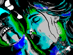
 01. Humming Bird by Diver + pROF score: 167
 - - - --------------------------------------------------------

Canny> I simply have no words to express my admiration...
It's just Superb!  Well done pROF, well done Diver! Just
Destructive technology, absolutely!  And what is depicted is beauty in
in the truest sense of the word: girl, hummingbird, petals
flowers.  The background is original, it does not protrude forward. Work has no
color clashes, and protrudingattributes, which is pleasantly pleasing
eye.  I can only praise this picture, there is no other option.
By the way, there is also a technical innovation that has never been seen before
used - triangle textures in the background behind the bird and
face.  The face is drawn in the spirit of pROF, whose technique has already
It's been frustrating lately. I’m just silent for Diver, because
you yourself know who is _now_ the best. Simply gorgeous! That's it,
I can no longer express my admiration! :)

Stan> Shine!  I didn’t really like the selection of colors on the face, but
the rest is great!

Gas> The girl's red nose raises dangerous suspicions...
The location of objects is not entirely correct, but this is just to
to find fault :) Also, the technogenic background seems to be not from here, although cam
It's cool - I really liked the diamonds.  For the rest -
great job - you can see it! :)

 ..##...##...##...##...##...##...##...##...##...##...##...##..

                   ...z a k l u h e n and e...

     In conclusion, as an apotheosis of the above, I will give
     your hit parade of the best pixel works with ASCii'02. be
     maybe someone will disagree with what
     sequences I posted the work, but it’s mine
     individual taste.  Your aesthetic delights can
     be different.
                             . . .

                      ...t o p t e n...o f
                        C a n n i b a l
                              . .

                1. Humming Bird by Diver + pROF
                2. Imagination by Stanly/Studio Stall
                3. Nice Day by pROF/4D
                4. Our Life by Depsy/Studio Stall
                5. Wild Dragon by Ice'Di/Triumph
                6. Ideas'Game by RTD/Brutal Creators
                7. Monsters by Slayter/Х-Теам
                8. Flove by Alex/Х-Теам
                9. FLYING by Bag/ULG
                0. GOD by Graph

----------------------------------------------------------------
ASCii'02 gfx review by Canny^TL, Stanly^sS, Gas 13; August, 2oo2
Share your thoughts about the article